UX Design for hotel booking website
This is a step-by-step of all the projects I did while studying UXDI’s UX Design course in 2021. The final product had to be either a flight, hotel or car rental website/app for mobile or desktop. Alongside the online classes and webinars I had to put what I learned into practice and research user’s pain points when booking accommodations, analyse my findings, conceptualise, create and test my solutions.
The content below is divided in:
1- RESEARCH (1.1 Benchmarking; 1.2 Survey, Note Taking and Competitor Usability Test)
2- ANALYSIS (2.1 Affinity Diagram; 2.2 Customer Journey Map)
3- CONCEPT (3.1 Flow Diagram; 3.2 Interaction sketches)
4- DESIGN (4.1 Prototype; 4.2 Wireframes)
__________________________
1- RESEARCH
1.1 BENCHMARKING
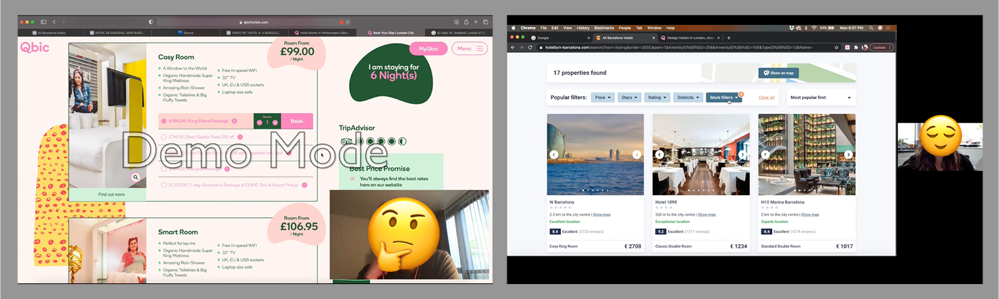
I did an initial research on competitors and best in-class websites to understand how they solve the problems I am trying to solve. On this step I observed conventions and best practices on 4 accommodation websites and also identified what were going against design principles and patterns, resulting in potential pain points to the user.
I observed in detail 4 websites and compiled my findings in a document containing notes and screenshots of pages and screen states.
Aspects I looked at while visiting those accommodation/booking websites:
-Homepage
-Easiness to find where to start primary use
-How secondary uses are displayed
-First impressions of the place/service based on the homepage.
-Search
-Micro interactions, labels, date picker
-How evident it is at the homepage (above the fold)
-Which information are necessary and how specific/broad they can be
-Confidence in picking an option to move on
-Choosing and filtering results
-Ways of displaying search results and editing user’s previous choices
-Types of filters and how they are organised
-Easiness and convenience to personalise results to user’s needs
-Easiness to find and compare common topics, such as cancellation policies and breakfast
-Easiness to compare rooms and rates
-Entering details and payment
-Ways to register
-How predictable is the booking process
-How to upsell without affecting user journey negatively
-How easy and trustworthy is the payment process
-Booking summary and confirmation of choices
I searched online for mentions of success cases of digital experience and user experience and picked 2 that implemented “The Hotels Network” direct book strategy and had their conversions increased: Website 1 (global presence, mostly in Asia) and Website 2 (Local presence – Dublin). Website 3 couldn’t be left out for a reference of positive benchmarking, since its business model and website is a well-known success. Lastly, I searched for a global hotel chain with over 200 hotels (mostly in Europe) and that could be benefitted by some UX investment.
The summary of positive and negative interactions for the 4 websites is as follows:
Website 1
Positive interactions
- Immersive first impression with video background of stunning locations and hotel services.
- General UI elements on the website (font, font size, colours/highlight colours, chunking) provide visual clarity to user
- Many filters available for rooms comparison (and in recent update, with option for room + breakfast/ room only and price range)
- Search bar is clear and present on rooms page, for editing choices
- Filter options that were chosen are displayed as tags, easily to be removed
- Signposts are easily found and present in all room options
- Room photos provide a good understanding on entire room size and amenities
- Possibility to change currency on rooms page
- Possibility to email that search to book later
- Presence of a summary of charges on rooms page and a plugin banner showing updated comparison of prices with 3 OTAs
- Summary of stay at checkout page details all taxes and payments per day
Negative interactions
- Search is hidden in one of the nav bar links
- Website language is limited to English and other 5 asian/arabic languages only
- Two ways of starting primary use
- Change in fields on drop down search not always update search automatically, and clicking on CTA button will wrongly search for previous inputs
- There’s no feedback on why user can’t proceed with search, just the disabled CTA button
- It is not possible to search for hotels in certain country without choosing a hotel from the list, which turns hotel comparison a time-consuming task
- It’s not clear which age group classifies a children, in guests field
- On rooms page, in filters, some labels are not clear in meaning (e.g. biggy room-roomy room-comfy room)
- Feedback message on rooms page for ‘No rooms available’ is not contrasting enough among the rest of content (visually similar to the offer banner)
- Taking the main flow ‘Search, on homepage–Rooms result page’ there’s no hotel information available for the user (‘Hotel info’ link on nav bar possibly was set with wrong sub links)
- Some add-ons options are not clear in how one differ to another
- There’s no progress indicator at checkout. Navigation link besides arrow to the left represent current page’s title rather than previous page
- Perk offer for booking direct is shown as free at OTA website
- At Payment information section there’s an option to add transportation at additional cost, but there’s no information of how much it costs and the cost is not added on summary
- Contact info under Guest details doesn’t consider case of paying person not being the guest
- ‘Add guest’ optional field can be confused with an option to add an extra guest to the stay
Website 2
Obs: at the time I visited this website I spotted some negative interactions that were later on improved.
Positive interactions
- Off-canvas menu allows user to focus on primary use (book a room) and start flow by clicking on very prominent CTA (which slides in the search bar)
- Great looking, well-directed photos of the hotel facilities slide automatically on the background of the page
- Presence of progress indicator at rooms page
- Modal on rooms page show offers and advantages of joining newsletter, with field to fill in email address
- Modal on rooms page shows the comparison of prices by booking direct and with other 3 OTAs
- Possibility to email that search to book later
- Price variance in each day on rooms page show gives user a choice to look for better prices on flexible dates
- Tags with signposts in each room’s offer help user to assimilate main information quicker
- Booking summary present in add-ons page
- Clear to understand on checkout page that details to be filled are the booker’s, possibility to check if guest info is different
- Perception of security increased with card logos, padlocks, protection messages, what is being charged per day, etc.
Negative interactions
- There’s no field to add guests at search bar
- At the results page (rooms page) there’s a default input of 2 adults on top of page together with other user’s choices, which requires attention to edit if it’s wrong
- If edited to different than 2 adults, the Occupant field doesn’t display how many adults, children or child age on field, as a reminder to the user. Instead, displays ‘Multiple occupants’ (information appears small on top of first CTA button of the list, which can be unnoticed)
- Calendar tool to change check in and check out dates according to best rates is not intuitive and might lead to some frustration during use. I noticed there was an update on this tool since the first time I visited the site, but the functionality is still not the best, because it goes against mental models of how a calendar works and contains change blindness. Micro interactions to show what date was picked don’t seem to be solving the problem, because the change of date happens inside the animation, being unnoticed. The animation still calls attention to the same square position, going against the mental model that if someone clicks on previous square means selecting the previous day. Another problem with this tool is that when choosing initial date (check in) there’s a limitation to choose up to 6 nights that are visible on the page. Clicking the arrow to the next week erases completely the check in and check out dates instead of leaving date choices selected (how a date picker in calendar is supposed to work)
- Same icons represented in different rooms have different meanings. The meanings can only be discovered if user hovers each of them
- Description of each room type requires opening individual modals, which makes comparison difficult (requires recall of many rooms’ amenities)
- Same thing happens when comparing current chosen room and available upgrade room on Add-ons stage. Spotting the difference between classic double and club double, for example, requires recall of text
- In Afternoon Tea add-on, it’s not clear how it’s charged, if it is per day, per person, or for the all days of stay.
- Check box instead of drop down button in add-ons give the impression the user is adding that option to the cart and doesn’t indicate there’s hidden information, options and prices once clicked
- It’s not clear when the payment is going to be processed at checkout page
- For town, postcode and county, there are no labels, just placeholders
Website 3
Positive interactions
- Homepage focus on the search bar and there’s no other label and menu that suggests initiating the task in a different way
- Interaction through fields is seamless, the label stays visible, transition from one field to the next is automatic
- Currency and Language are identified as one symbol (the conventional globe icon)
- Calendar has option to switch to a flexible mode, where user can be offered available results for variable dates (and, thus, compare best rates within a period)
- Children and Infant age group is identified, at Guests field
- On the nav bar, the user area/login is represented by the “user” icon and the small burger menu suggests there’s a list of links once clicked
- Result page automatically opens content view mode to list besides a map, as for shared homes geographic location is an important information to compare
- Most popular filters are displayed side by side to be “activated”, while others are inside Filters
- User search preferences are displayed on page and on search bar on top of page to be edited
- Multiple images of each accommodation and key info in each card help user get a good, quick understanding of each option
- Labels on each home card are the same type of information, in the same order, to make comparison possible (max guests, n. bedroom, n. bed, n. bathroom, Wi-Fi, kitchen, washing machine, self checkout, etc.)
- Filters are grouped by category and each filter of a group is not necessarily ordered alphabetically. The most popular normally come first.
- CTA to apply chosen filters informs how many results are available before user leaves the modal window
- Heart icon to save accommodation is a good way to shortlist favourites to compare later
- The focus of content display at accommodation page is on the photo gallery. Display of thumbnails instead of one photo at a time makes the assimilation of the overall place quicker to the user
- List with 4 main information about the place are normally the same type in all accommodation pages, to facilitate comparison
- Floating card with summary of charges and CTA to reserve accommodation follow along the page scroll
- 10 main amenities are shown while others can be seen if clicking to expand (saving space). Not present amenities are crossed-out.
- Important information such as house rules, health and safety and cancellation policy are summarised in short sentences + icons, to facilitate quick assimilation of info. Topics that need more details have Learn More to expand info.
- Location (a map), reviews and things to do nearby are also easily displayed at the accommodation page
- Where there’s limited space and more information is needed, a hover reveals tool tips (e.g. explanation of each fee in price summary)
Negative interactions
- Clicking on a price-pin on the map doesn’t bring up the correspondent card on the list, for a more detailed information about that home, the same way hovering a card will highlight the correspondent pin on the map
Website 4
Positive interactions
- At rooms page, 2 tabs display simulate the total amount of stay, with subscription discount applied and without the discount, in an effort to entice user to subscribe
- Search bar with user’s inputs is present in search results page and hotel/rooms page and the CTA is called Edit search, rather than search
- The presence of a pop-up between pages with field to add email and join the advantages club, with clear explanation on advantages makes it easier for the user to join
Negative interactions
- First impression of the website is that it seems out-dated and carousel photos are not hotel-related images, so the proposition is not clear to the user
- Translucent search bar is hard to find on top of a crowded automatic photo carousel. When page is scrolled, bar goes quickly at the top of page, making it hard to perceive it.
- At the location field, when opening drop down of countries, cities and hotels, the city names are not visually different compared to names of hotels, so they are difficult to be spotted. They could have higher hierarchy to differentiate cities’ groups and be evident that are clickable
- Check in and check out dates operate in individual calendars, without showing date range connecting both dates. It could be useful for an accommodation booking date picker to visually display the date range, since usually people who travel have fixed amount of dates to stay. It’s better to visualise that one full week was marked or a weekend, for example.
- Long question “how many rooms would you like to book?” takes user’s time and layout space. A simple ‘Rooms’ label would have worked better.
- The function of the “plus” icon after room/guest field has no label (promo code) when bar is located on top of page, so the function of that button is not clear
- At search results and hotel/rooms page, important information of each hotel are represented by icons, which makes it hard to assimilate the content
- Description “Guests like us because of…” in each hotel card is subjective, not a product differentiation and difficult to compare to other hotels. (E.g.: friendly staff, very clean and comfortable rooms, etc.)
- There’s no other information about the hotels’ facilities, in text or photos, other than the icons
- The room rates are not classified and organised in a standard way among different hotels. While some are clear to understand (cancellable/not cancellable with and without breakfast), others have multiple options not clear to understand
- It’s not stated if price of room is per day or for all days
- The hotel’s rating signpost is not clickable and doesn’t tell the origin of that data (internal review? Trip Advisor?). It doesn’t look trustworthy.
- For some hotels there’s no correlation between room photos and room title. In an overall, the website should set a consistent information architecture to adapt the hotels of the group, without compromising user’s experience
- After some minutes, the progress of the search is erased, and any internal results/rooms page is refreshed to the homepage, so users can’t keep their search to continue later
- At details step, as part of the checkout, it’s not clear how the upgraded add-on is worth it’s price, the description is generic and contains amenities already included in all rooms
- Labels with different purposes receive the same red brand colour, which can be associated with error messages, unavailable, even when it was not the intention
- At checkout, there’s no price breakdown, detail on amount of VAT, reminder of when the payment will be taken, what is the cancellation policy, etc.
- Payment page doesn’t ask for address nor CVV, which raises questions on how they are preventing fraudulent transactions
1.2 NOTE TAKING, SURVEY AND USABILITY TESTS
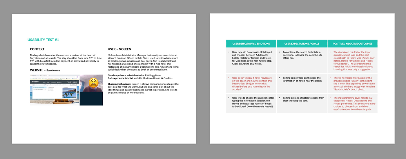
I watched non-edited videos of two users going through tasks on two hotel websites each. As I identified pain points and good interactions along their journeys, I took detailed notes.
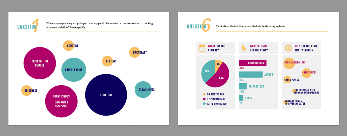
Insights from all previous steps helped me create a survey to better understand the goals of potential costumers booking hotel accommodations.
I conducted a comparative usability test with two users, recording and moderating the remote sessions, and also did an in-depth interview previous to the usability tests.
2- ANALYSIS
2.1 – AFFINITY DIAGRAM
The Affinity Diagram step was intended to be a collaborative project. So I presented the usability test notes and survey results to a colleague and we worked simultaneously on FigJam to create notes and group our findings.
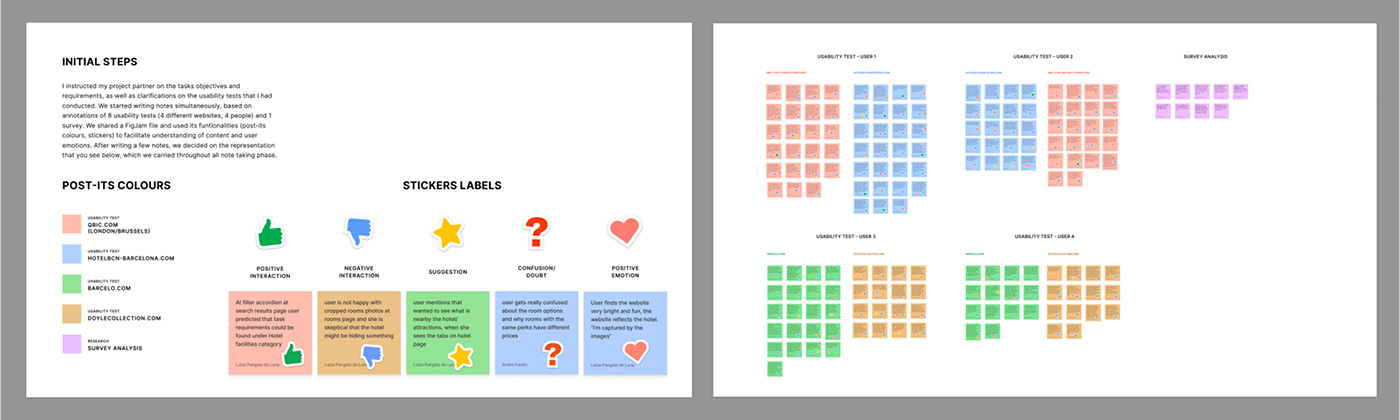

Topics to be addressed from the data collected during research (competitors usability tests, survey) and structured/analysed on the affinity diagram.
– Users don’t feel confident on where to start the booking process when there is more than one way to start the journey at the homepage. A search bar is familiar to them, as they use the tool in websites like Booking.com, Airbnb, Trip Advisor, etc.
– Users rely on Trip Advisor’s ratings and guests’ reviews about the hotels and that information contribute to their decision-making. Curated positive-reviews-only and ratings not linked to the source of data make users sceptical about the hotel.
– Difficulty in finding important information related to the booking early in the journey, especially when comparison between hotels is needed (Breakfast included or not, cancellation policies).
– Users expect to find information such as breakfast and cancellation policies in filters (like in OTAs), although in some hotel websites they will appear for the first time at rooms’ offers page.
– Room descriptions are sometimes too long, not clear to understand the meaning, unnecessarily descriptive in basic/expected amenities, making them hard to compare with other room options.
– Users rely much of their impressions and expectations on what they are able to tell from the available photos. (First impression of hotel style; presence or not of hotel facilities, including eating area and type of breakfast; size of each room, their amenities and in what one room differ from the other).
– Presence of many rooms’ options combined with many types of offers make it difficult for users to understand how much each individual service costs/ how much user is saving/ what offer is worth to choose.
– Users not being sure of final price and hidden fees until checkout phase.
– For users, when there’s a choice of booking with breakfast and without breakfast, they conclude that breakfast is not included for that hotel. Hotel websites tend to use the term “breakfast included” to represent room with breakfast, even if breakfast charge is added in the stay. This can make the user confused.
– Users want to know where exactly the hotel is located in relation to attractions nearby and to other hotels (especially if they’ve never visited that city before), to compare distances and find commute conveniences. Mental models of maps, present in websites like Airbnb and Booking.com, make users expect to find a map in hotel sites to get that type of information.
– Add-ons page is not an essential step to book a room, but at the same time the hotel will want to upsell. When the add-ons page is too busy in information the users feel overwhelmed and check the entire page even if it’s to guarantee there’s nothing important being left behind.
– All users from the research compare accommodations and prices, mostly in OTAs, and it’s possible that they might land at the rooms’ page coming from those OTAs, to complete their booking.
– Especially during the 2020 pandemic and the uncertainty of lockdowns and hotel practices, users need to know clearly about cancellation policies before committing to a booking.
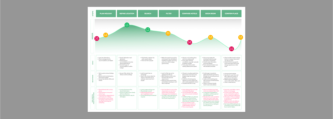
2.2 – CUSTOMER JOURNEY MAP
After identifying the user experiences that needed to be addressed I defined the high level steps in the journey, creating a Customer Journey Map. This helped me understand where, along the way, the experiences were not being smooth.
3 – CONCEPT
At this point I knew what the problems were and I needed to define:
- Where and how to start the journey on homepage
- Where and how to put signposts such as breakfast, cancellation policy, location, ratings, etc. early in the journey, to be used as an easy comparative information
- How to easily organise price offers + info, especially when there are multiple combinations of services (with/without breakfast, free cancellation/not, offer packs)
- How and when to let users know the final price of the booking with breakfast and fees included, and make this information available to be used as comparison factor at early stages
- How to display useful information on rooms’ page, considering that users might land there from some OTAs
- How to offer add-ons without taking much of user’s time in the journey
- How to use imagery as useful content that helps users get quick information about the hotel
3.1 – FLOW DIAGRAM
To fix the issues, I structured a Flow Diagram for the hotel website I was going to prototype, focused on the primary use (book a room). My hypothesis were that:
- Filters with signposts options, available at the early stages of comparison will make the process of decision-making quicker for the user
- A step of comparison between hotels’ main features (even when 2 or 3 branches of the same brand are compared), including signposts, will make the process of decision-making quicker for the user
- A filter to organise room amenities, offers details and prices will facilitate user’s understanding about them and make the process of decision-making quicker for the user
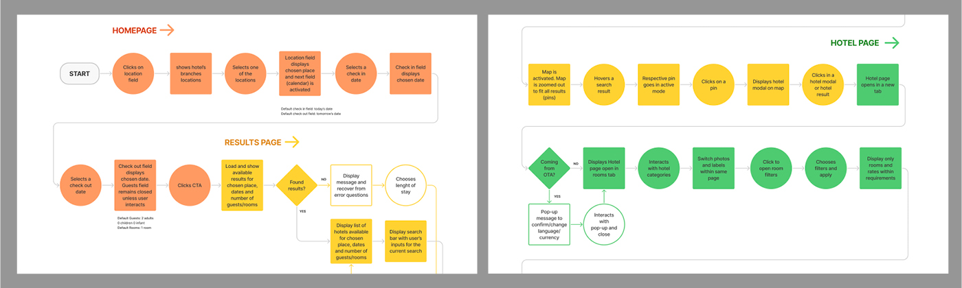
Many hotel pages that I observed have a structure of a corporate page for steps that require content comparison. This demands the user for an active search for information (reading and memorising) to compare options, which takes a lot of their cognitive load and good will in this time-consuming task of booking a room for holidays.
The use of filters, very common tool in OTAs to compare great amounts of hotels at once in several categories, could be beneficial as well to compare information in small hotel chains and even in categories within one single hotel. When the user determines objective pre-requisites such as price range, location, hotel facilities and cancellation policies, for example, what’s left to compare are subjective criteria, such as hotel/room appearance and guests opinions in reviews, for example. And that reduction on information hunting, leaving a filter tool to make most of the effort for the user, might facilitate comparison and, therefore, the process of user’s decision making.
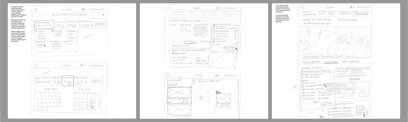
3.2 – INTERACTION SKETCHES
The flow diagram was then turned into paper sketches of screens and screen states for users flowing through the hotel website.
4 – DESIGN
4.1 – PROTOTYPE
I designed and prototyped a medium fidelity prototype on Figma, containing high-level flow, screen layouts, text and basic interactions, and conducted a usability test to identify any problems.
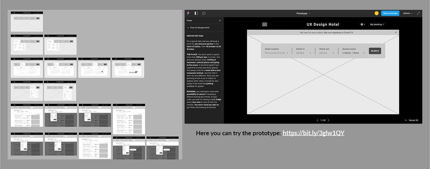
The prototype can be tested here: https://bit.ly/3glw1QY
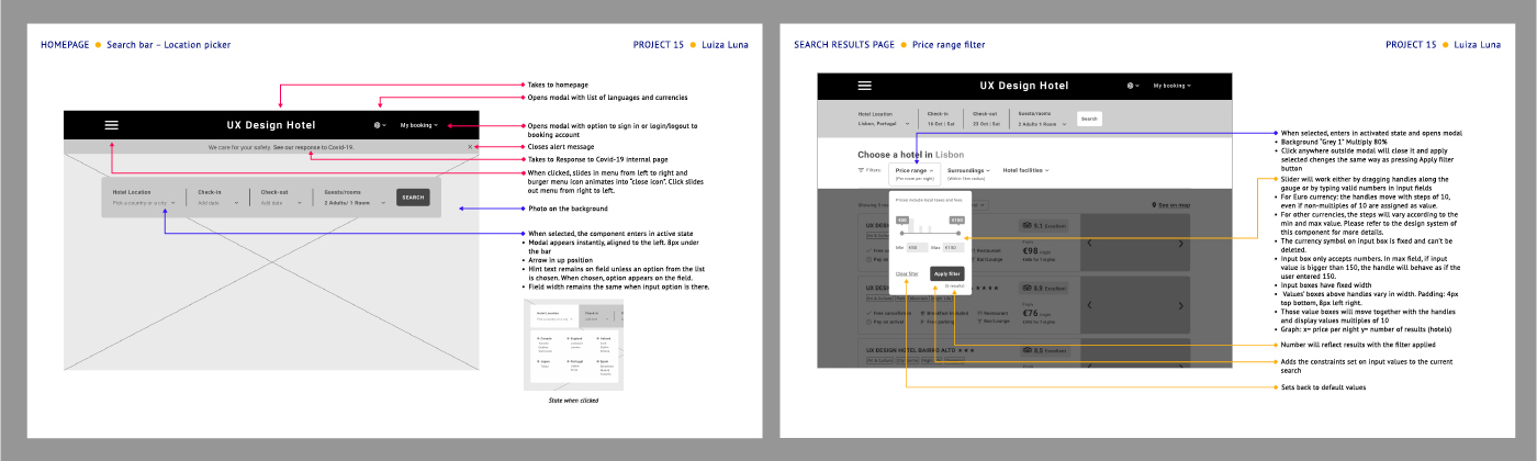
4.2 – WIREFRAMES
(note: although it is common to use the term “wireframe” to refer to a low fidelity static design of a software, UXDI considers it a document containing screens, annotated notes and system rules, which serve as blueprint to handle to developers)
Finally, after I made necessary adjustments on my prototype, I created a document explaining screens and states of the flow I designed, from homepage till confirmation page. These notes would help developers understand how I envisioned the interactions.