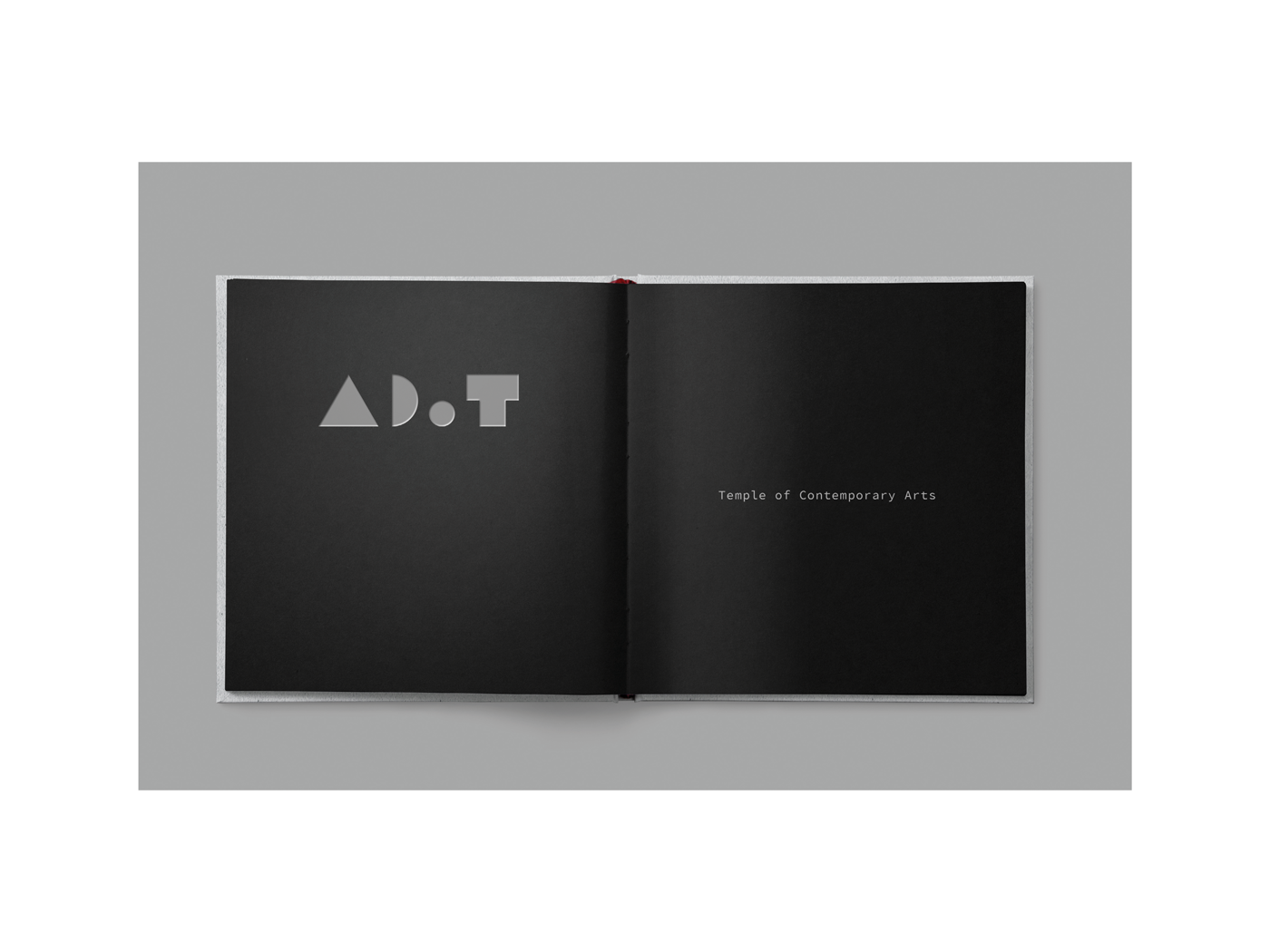
ToCA
Type of project
Concept project answering to the brief given by Red Dog during ICAD Upstarts programme. I was responsible to create a solution and had one meeting with the assigned tutor before presenting the project to Red Dog.
Context and problem
The Central Bank of Ireland built in the heart of Dublin City Centre was relocated to a new purpose-built head office at North Wall Quay. The iconic building on Dame Street was then renovated, while retaining much of its original character, and converted into a combined exhibition and performance space, with a design shop. The task was to come up with a name and logo for this creative space and create a visual language to complement the identity, expressing it through some deliverables: brochure, website and promotional item. Aspects to take into consideration: the audience (Irish and international), formats and finishes that complement the design and appeal to the audience, key features or local landmarks and the phonetic of the new name (easiness to pronounce).
Design process and outcome
This building and area was a known spot for me, because I used to live just besides it and pass by there everyday. For this project I wanted to honour the materials and shapes that make the building iconic: the bulky shape, geometric forms, gold, concrete, the “Golden Tree” sculpture, so I took pictures of my observations and researched how is the communication of art museums and galleries. Once I brainstormed around my findings I used those elements to be part of the brand ToCA, acronym I created for Temple of Contemporary Arts, a reference to the area Temple Bar, where the art gallery is located. The specially crafted promotional item, aimed to stakeholders and potential partners, was designed to take them closer to ToCA and encourage playfulness with the decorative pieces. The design choices in the brochure, card, website and hoarding result in an expressive identity that is true to its origin and concept while not competing with the art in the exhibition.
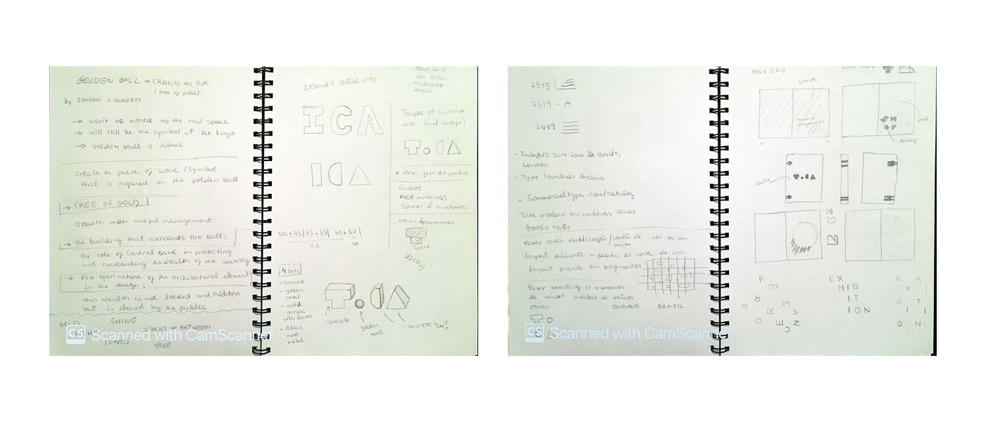
Idea generation/sketches

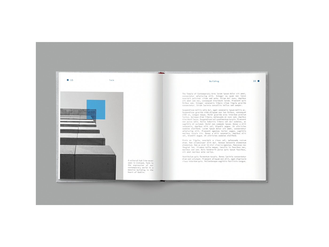
Photo: Central Bank, the hub of ToCA.
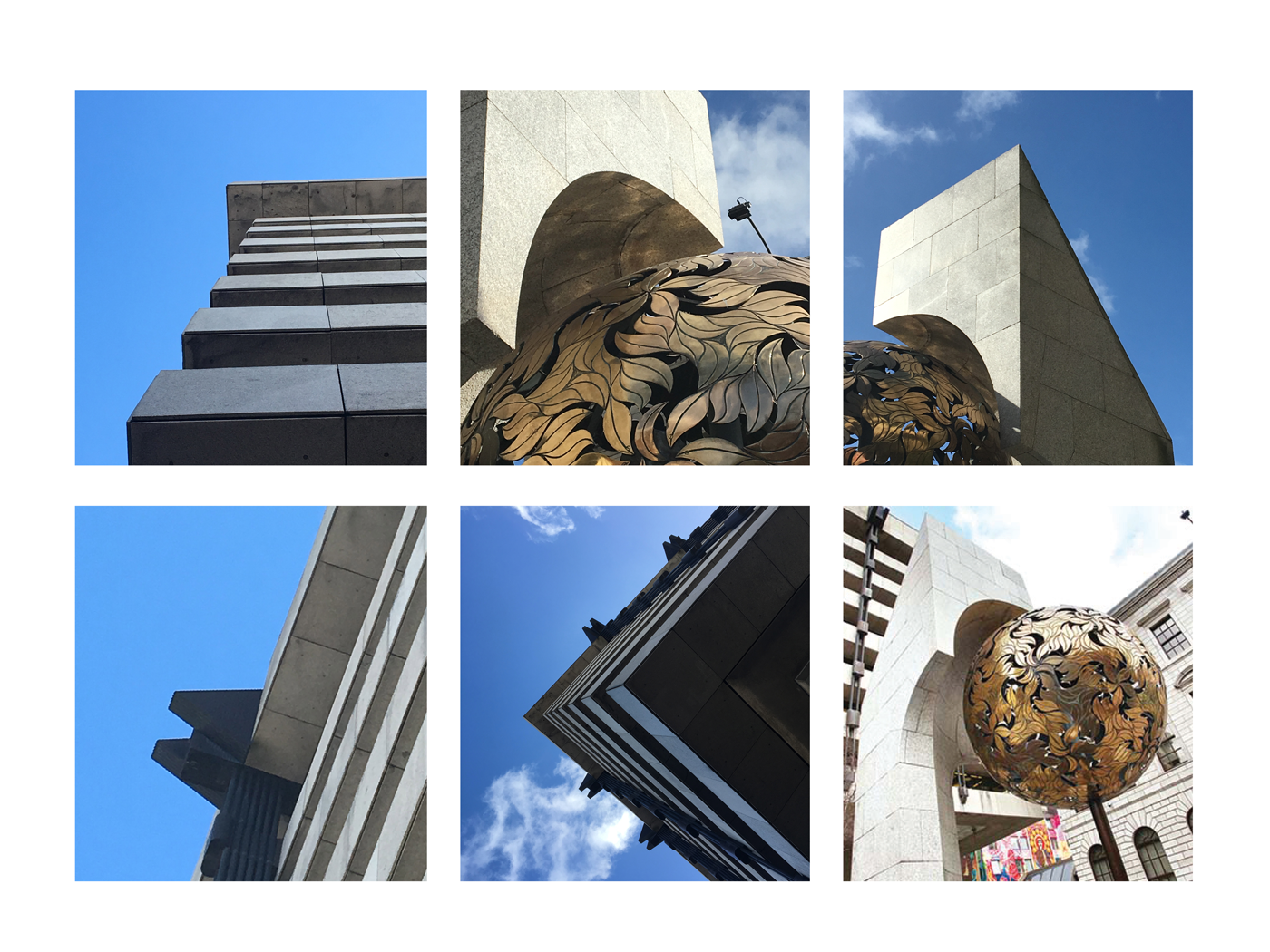 As a research for the project I visited the place and was inspired by the architecture, materials and shapes.

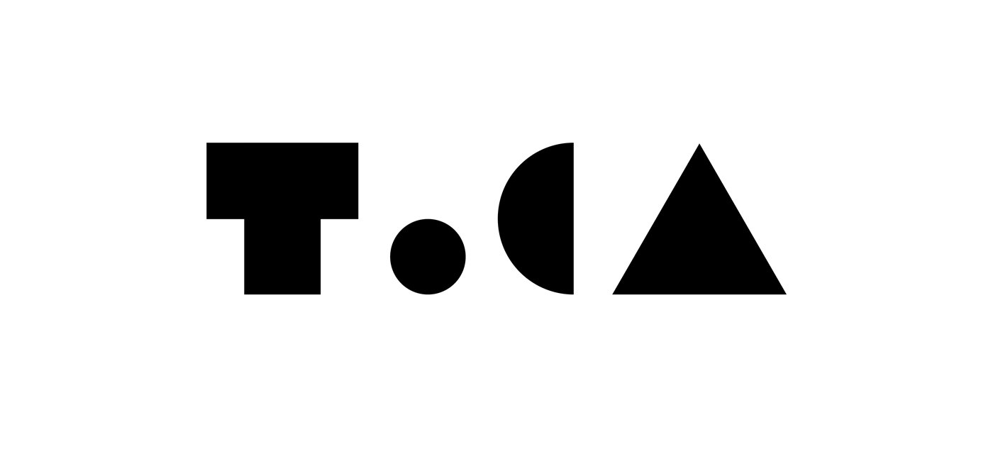
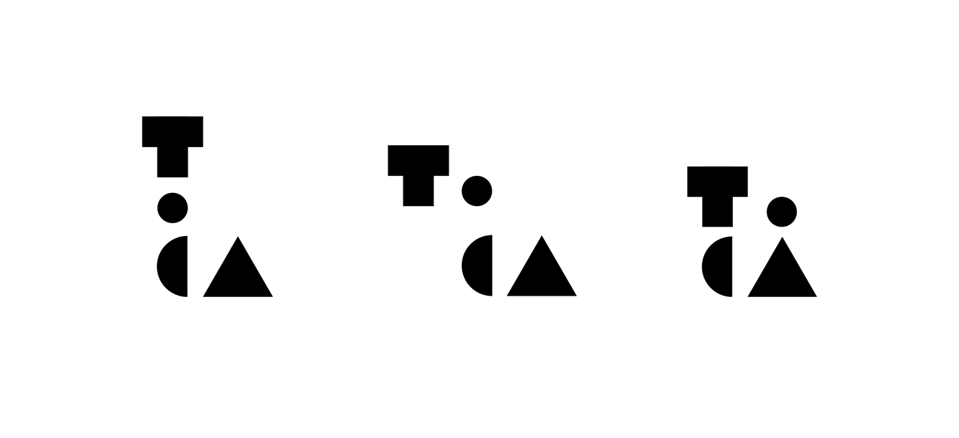
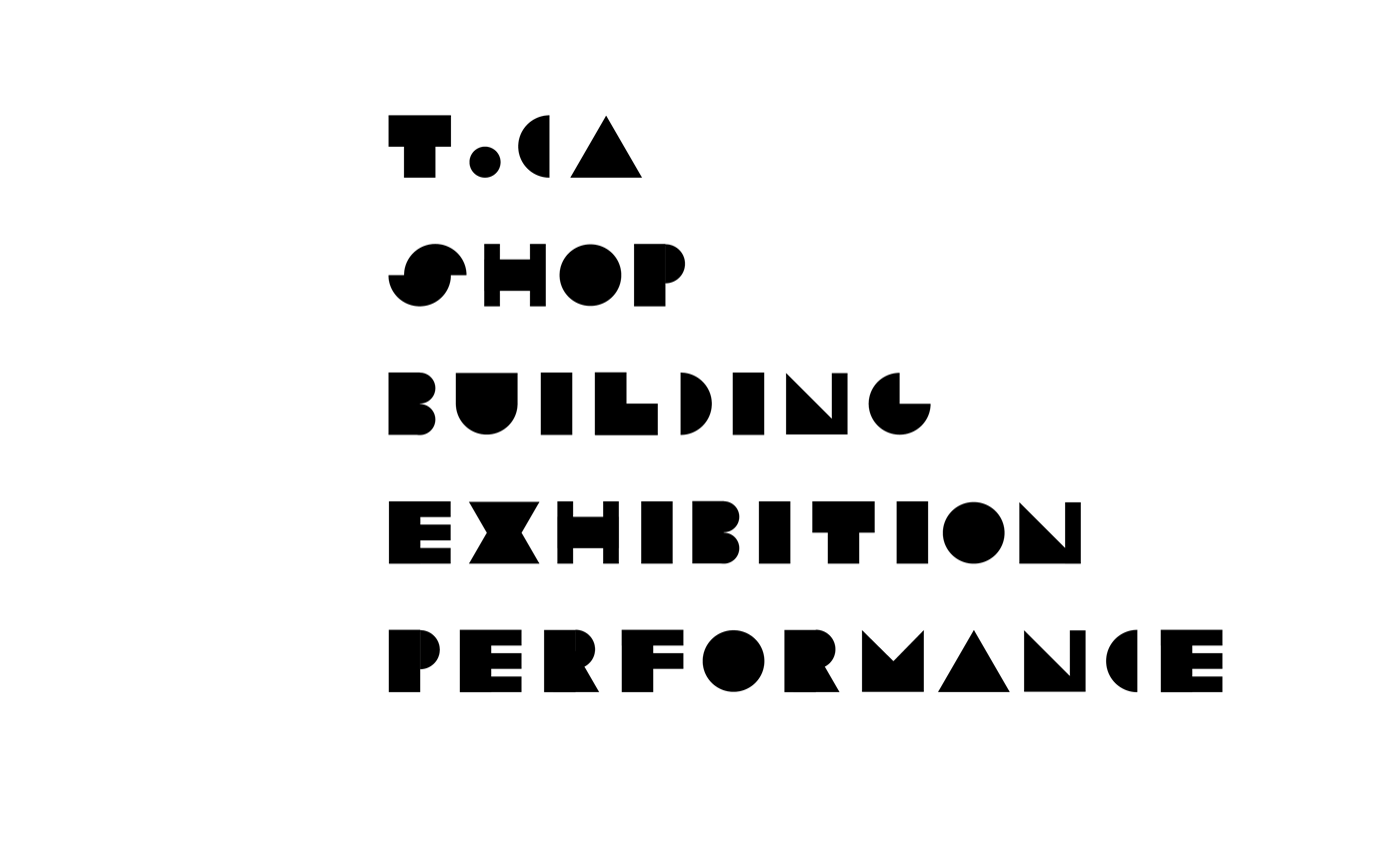
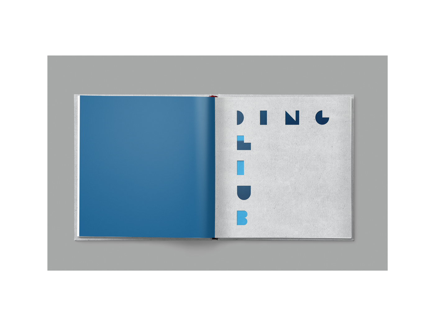
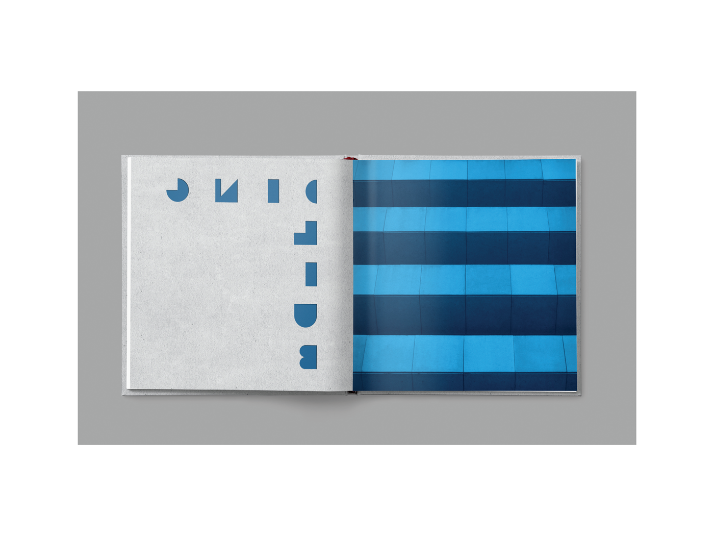
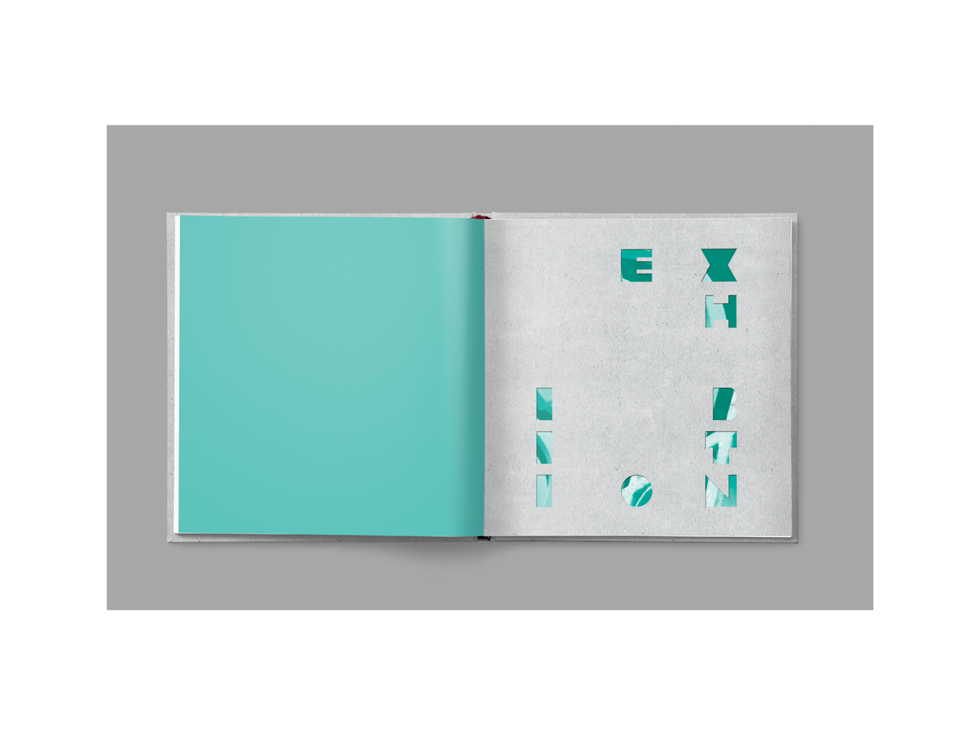
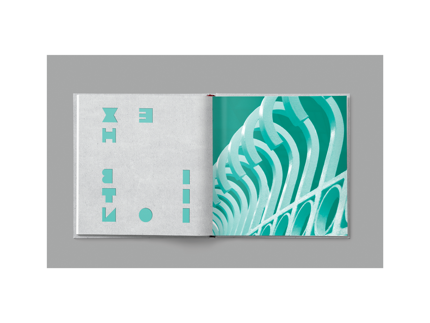
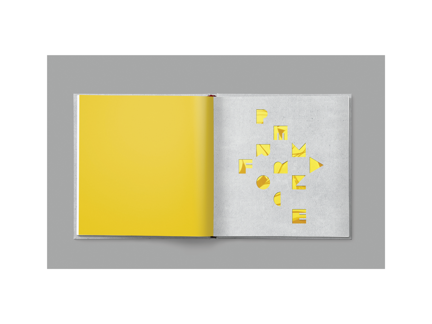
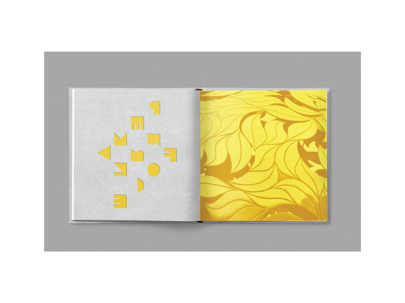
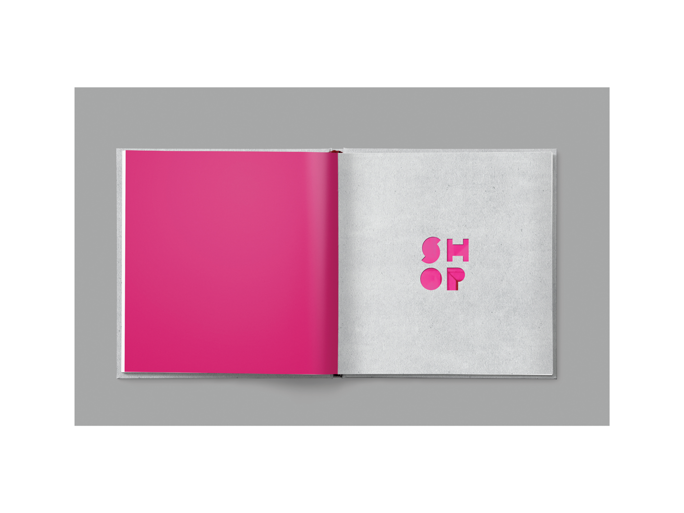
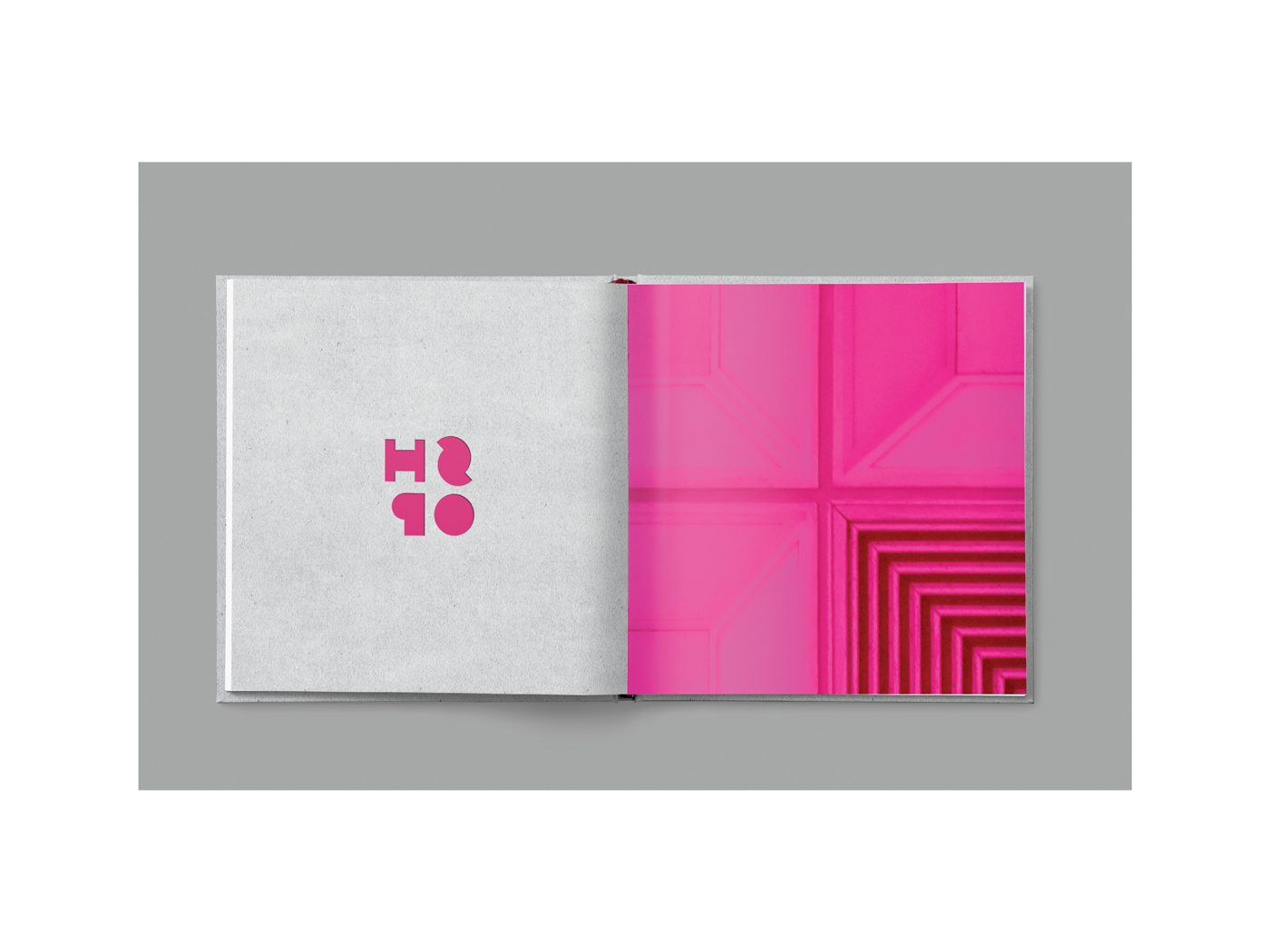
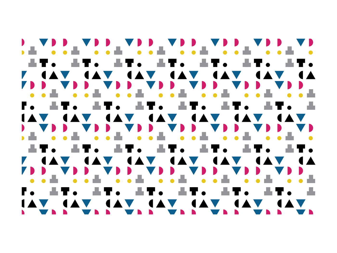
A bespoke typeface was created for the logo and headlines of some deliverables. The deconstruction and rearrangement of these characters on the brochure give them personality and playfulness.
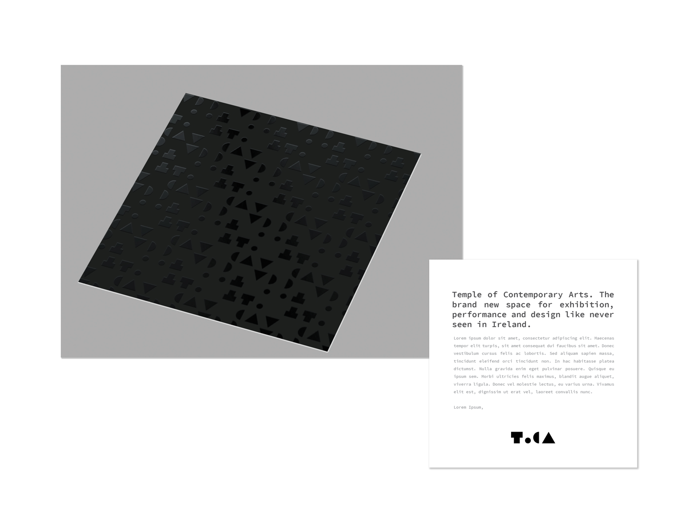
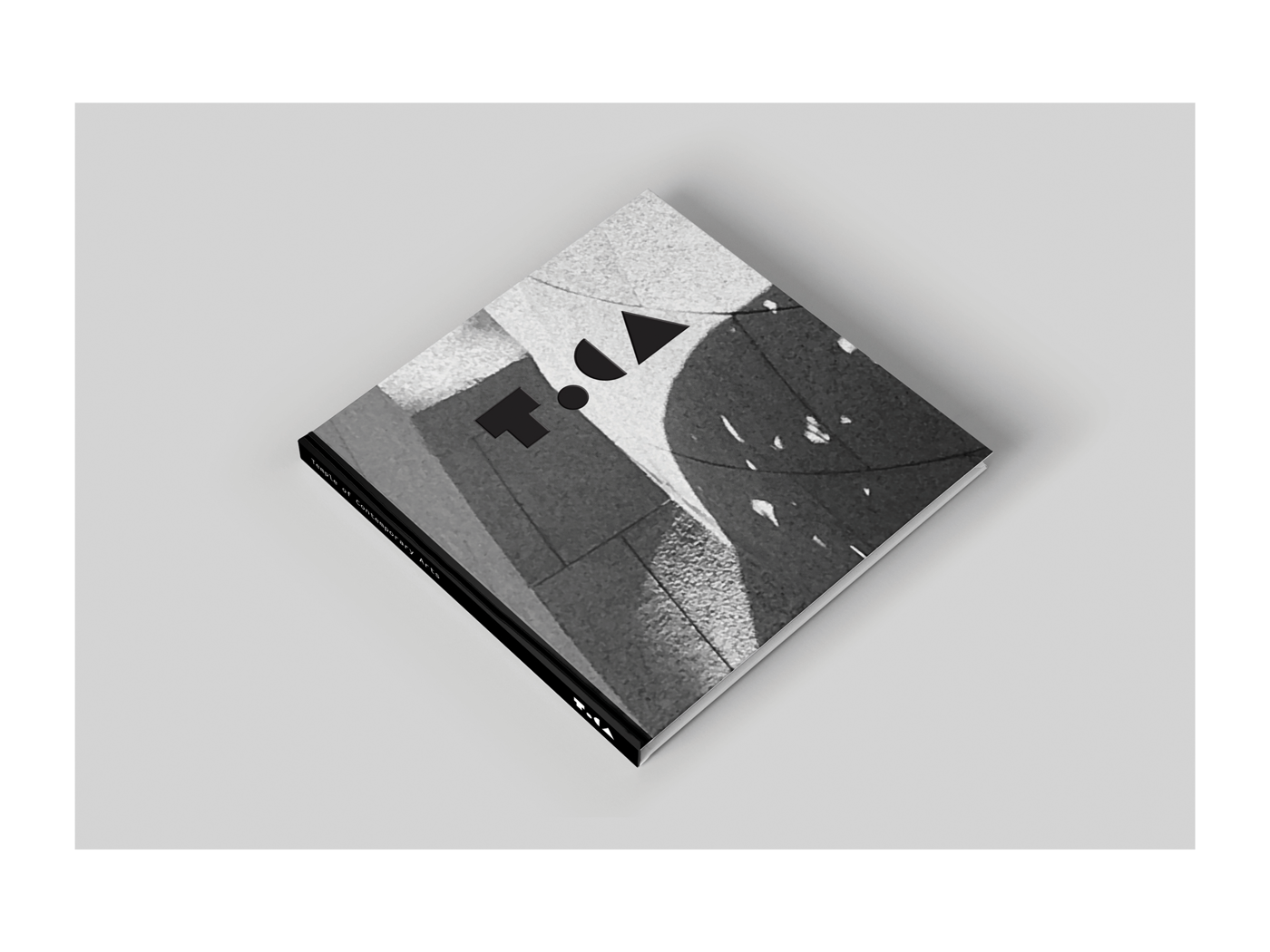 The brochure showcases the new space for art. In this fragment I photographed I could find many elements that summarise the whole area. The geometric and organic, presence and absence of objects and materials worked together to deliver this inspiring cover.
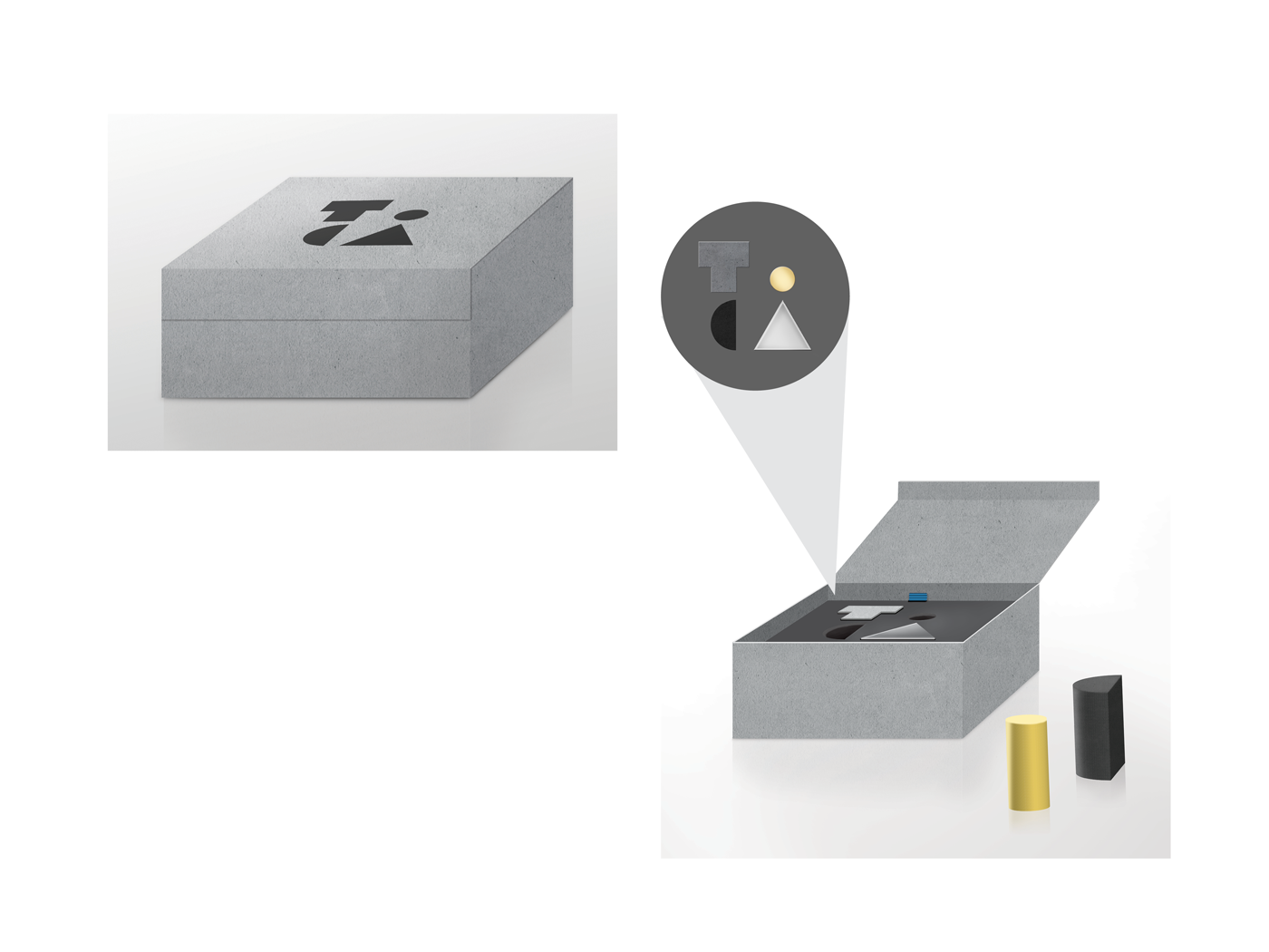
This box is a promotional item given to the media, stakeholders and potential partners in the arts. It contains a set of four decorative paperweights and a brochure. The paperweights make reference to the materials used to construct the iconic building.
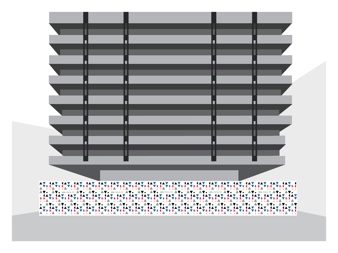
During construction work for the building to become ToCA it was created a hoarding around the area. It contains the information of website for people to know about the new art hub taking place.
ToCA website
